
Redesigned analytics dashboards for 4 core products at Posh AI (leading financial services AI company), driving 25% increase in renewals + sales.
Lead Product Designer | Web + Tablet | 2025 | 6 weeks
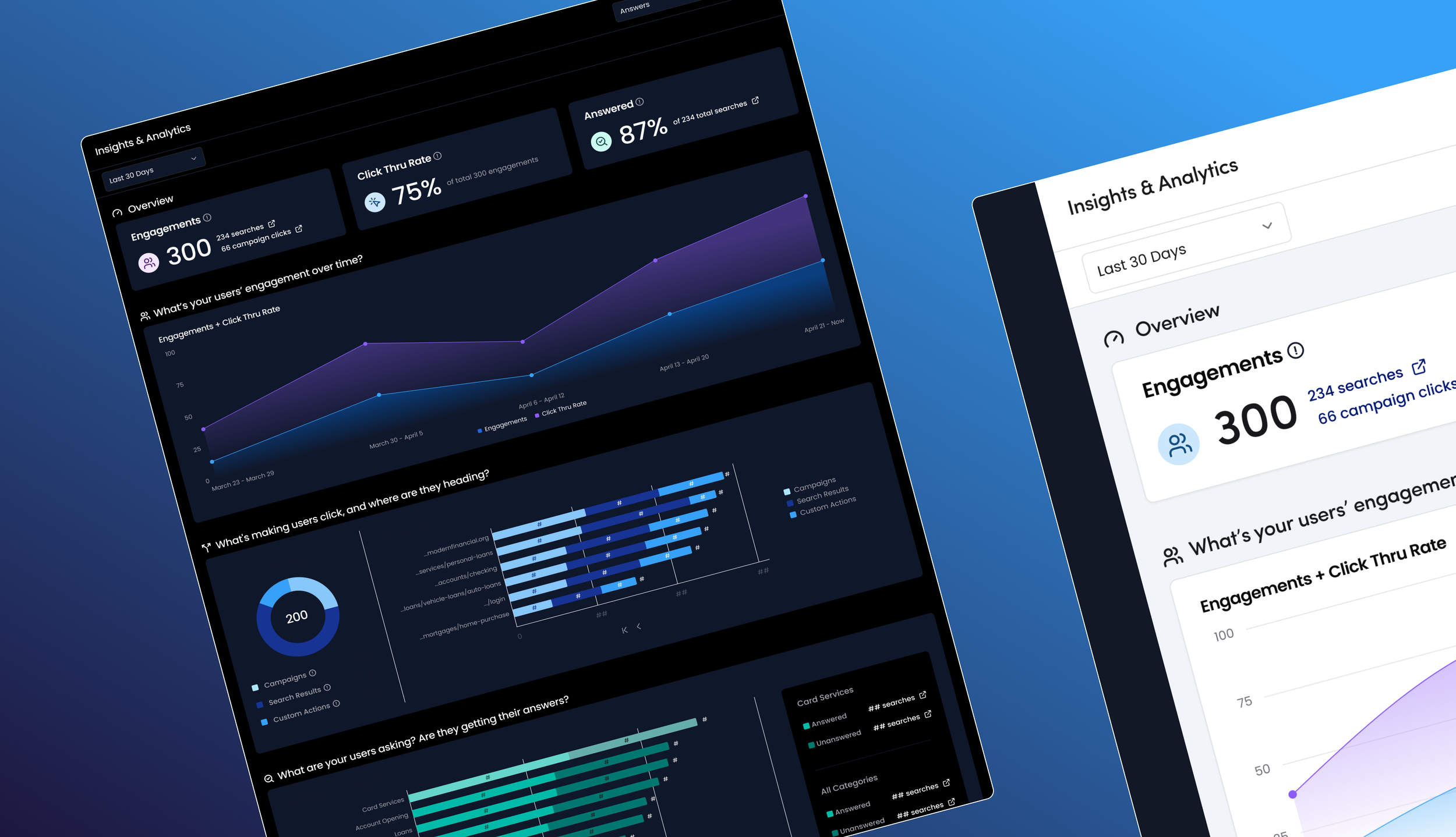
Problem
Analytics dashboard failed to show clear ROI to clients, making Posh lose sales across all products
Design Proposal
First, redesign the Answers (gen-ai search) analytics
I led a cross-functional workshop, aligning Posh on prioritizing the Answers product analytics page redesign first to maximize impact + minimize effort.
My Scope
Stakeholders
3 Key Stakeholder Reps
Stakeholders used the Answers analytics page to demo to clients at every stage of the sales cycle, and beyond.
Users
Financial Institution Users (Clients)
VP level users needed a quick Analytics overview while power users needed deep, actionable insights.
Moderated Interviews
Key User Insights
Analytics data on the old page was unhelpful.
What % of users who search via Answers start or complete an account application?
Area graphs "looked nice" yet vague.
Top Search [Docs] = proxy for top searched topics.
Solution Ideation
Defining key analytics data to show across all products
Key themes for Answers:
Is user engagement up, down, or same?
Is Answers driving users to FI's site URLs?
What URLs?What actions = user clicks?
What topics are users searching for?
Are they getting their answers?
Solution Ideation
HMW show what topics users are searching for?
Solution Ideation
Right sizing Gen-AI categories across all products
Design Ideation
Key Concept Test Insights
Overall, new analytics data was helpful
Power users loved ability to “drill down”
Categories were better than “top search results”
Some internal terminology was confusing
Users wanted numeric data without hovering on charts